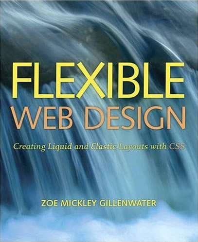
Flexible Web Design
Creating Liquid and Elastic Layouts with CSS
Learn how to design and build attractive web sites that maximize usability and accessibility, adapt to changing amounts of content, and hold up under a variety of user preferences.
Liquid or fluid layouts change width based on the user’s unique device viewing size. Elastic layouts change width based on the user’s unique text size. Both types of flexible design offer clear benefits to users, who can view sites at sizes that work for their needs, but they can pose challenges to web designers who are used to perfect pixel control. Still, when planned and constructed correctly, flexible layouts can be visually appealing and reasonably easy to build. And the concepts and techniques of flexible web design can benefit fixed-width CSS designs too, as designers learn how to design for the inherent flexibility of the web, instead of the rigid qualities of print media or grid-based layouts.
Using standards-compliant and cross-browser compatible (X)HTML and CSS, in Flexible Web Design: Creating Liquid and Elastic Layouts with CSS, designers will learn:
- The benefits of flexible layouts
- When to choose a liquid, elastic, or hybrid design
- How to design and slice graphic comps in a way that makes flexible design achievable
- How to build liquid and elastic layouts from scratch
- How to create flexible background graphics and scalable content images
- When and how to limit the degree of flexibility in a web page
What you'll learn, by the numbers
- 15 liquid/fluid layout techniques, both two and three column
- 11 elastic layout techniques, both two and three column
- 2 liquid-fixed hybrid layout techniques
- 5 elastic-fixed hybrid layout techniques
- 9 flexible background image techniques
- 5 flexible foreground image techniques
- 5 problematic design features to avoid in your comps
- 16 helpful design features for flexible layouts to include in your comps
Who should read this book?
Flexible Web Design is meant for professional web designers who already have experience creating web sites from scratch but want to improve their CSS layout skills. Even if you intend to continue designing fixed-width sites primarily, you'll learn how to design your comps and build your pages in a way that makes them more adaptable to the user-controlled nature of the web.
If you're interested in building responsive web designs, Flexible Web Design will teach you dozens of fluid layout techniques as well as a variety of approaches for making your images flexible to fit within fluid containers. You'll learn how to approach a new project with responsive web design planned in from the beginning, creating comps that will work as flexible, responsive layouts. (You won't learn the media queries portion of responsive design, but can learn this in the free excerpt of Chapter 6 of Stunning CSS3: A Project-based Guide to the Latest in CSS, Zoe's newest book.)
This book will be especially helpful to former print designers or web designers used to table-based layout who still struggle to produce pure CSS layouts. It will teach you how to think in the CSS mindset so that designing for CSS becomes natural and you no longer find yourself fighting against inappropriate comps when it comes time to actually build the pages.
